What is a Responsive Website?
30 Dec 2013
Smartphone usage is increasing, so making a website that is friendly to smartphone users has now become a critical part website construction. Even search engines such as Google are recommending that your website serve content in optimized formats for both desktop and smartphone users. Mobile browsing is expected to outpace desktop-based access within a couple of years.
With more devices come varying screen resolutions, definitions and orientations. We can’t keep creating custom solutions for each one. The font,element & image size must change with the screen and browser width, and orientation (portrait or landscape). As the browser gets narrower, the sizes throughout should get smaller and remain proportional to each other.
Still confused as to what is actually a responsive design?
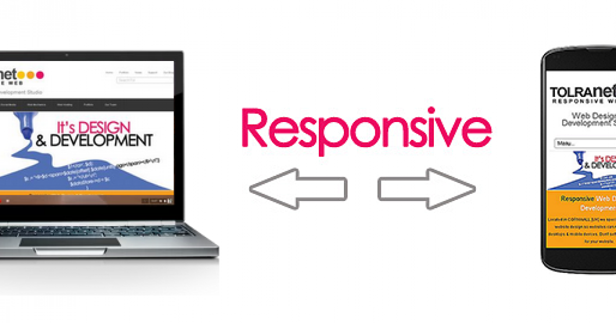
Let's see it in action! This website is a Responsive Web Design. You can view it on your mobile device. If you are on a desktop computer, slowly make the browser thinner and wider by sliding the left & right sides of the browser window. You should see the layout magically adjust itself to more comfortably fit the new width of the browser, even if you make the page as skinny as the resolution of a mobile phone.
So, how do you deal with this in regards to your website?
There are a few ways you can do this (separate mobile websites, phone apps, etc), but the most cost effective way is to have your website built in a Responsive Website Design (RWD). Responsive Website Design is about providing an optimal viewing experience across a wide range of devices from mobile phones to desktop computer monitors, including smartTV's. When viewing is varied between larger screen sizes and browser widths, the design remains flexible.
In the field of Web design and development, we have to be on our toes to keep up with the endless new resolutions and devices that have access to the web. Designers & developers alike can't afford to be outdated in their skills. If you're looking to get a website built, you really don't want a website that can't be viewed on various devices. Design and development should respond to the user’s behaviour and environment. Responsive Website Design can create a great custom experience for everyone, no matter what they are viewing the Web on.
Which brings us to the next issue, how much extra will it cost to get this functionality? We think it shouldn't cost any extra for a simple website. If there are custom elements on the website, then there can be extra charges to get the responsive functionality out of them, which in reality should be within the confines of customisation anyway. But you should be charged NO extra for a responsive website. If you have been quoted more, come & have a chat with us!
Smartphone penetration has risen to
62%
of the UK population
[Google - May 2013]
65%
of the Australian population
[Google - May 2013]
56%
of the US population
[Google - May 2013]

Web Producer, Creative Director, Content Creator & Distributor at clearFusion Digital, & specializes in helping businesses plan & grow their website.


