Goodbye Web of 2014 & Hello Web of 2015!

06 Jan 2015
A lot occurred around the World in 2014, and a lot occurred on the World Wide Web. On the web we saw a another swing in how we used the web, we saw new technologies, we saw elements mature and start to be taken seriously. Unfortunately we didn't see the end of non-mobile-friendly websites, but fingers crossed we might see that in 2015!
So what did happen in relation to the web and websites in 2014, and where how are they progressing into 2015?
-
Increased Mobile Use
- Smartphone and tablet usage has skyrocketed and is overtaking desktop traffic
- Adaption to a growing mobile-enabled user base has made businesses more agile
- Those that have embraced responsive websites are witnessing the ROI
- Websites are now constructed with the screen touch/swipe in mind
-
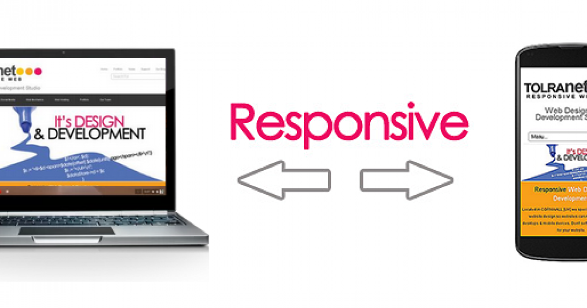
Responsive Design/ RWD - Responsive Web Design
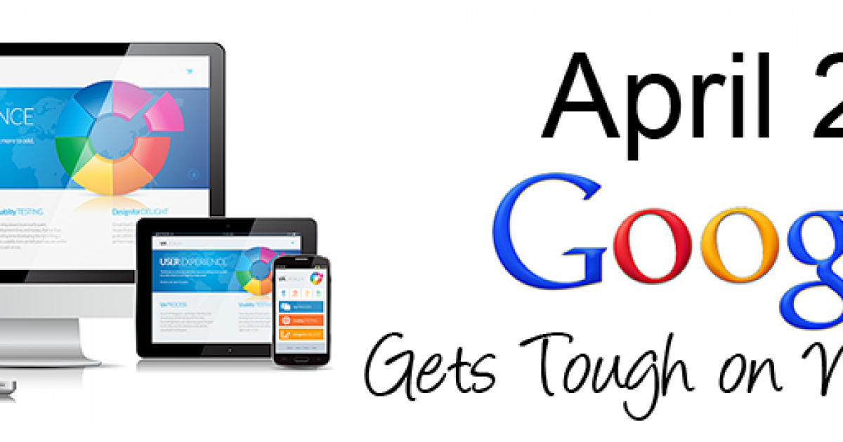
- 2014 was the first year in which mobile browsing surpassed that of desktop
- Legibility and attractive rendering regardless of screen size is now a requirement
- A non-responsive website could negatively affect your Google ranking
- Which elements work best on a smartphone, tablet, or desktop-size screen, for the most seamless and enjoyable user experience
- By designing websites responsively you don’t have to create multiple versions of a website
- Responsive websites are eliminating the expense of developing a native app
- Responsive websites are eliminating the need to spend extra marketing dollars convincing your audience to download a native app
- RWD isn’t likely to disappear from common vernacular anytime soon
-
Simple Design
- Site visitors get what they need seamlessly and without complication
- Powerful images. Meaningful content. Sleek and purposeful navigation
- Experienced design teams are aware of what is working, and what is working well
- Just because you can doesn't mean you should
- More sites are avoiding loading new pages, preferring one page design
-
Storytelling Design
- Compelling copy coupled with strong imagery
- Let them discover who you and your company are
- No more "We are so great because” over and over again
- You should be able to move down from the top of the page to the bottom in 30 seconds & know who we are and what we do
- You should know where to go to make a purchase, or visit our blog, without having to search
-
Typography
- The font face used within your designs determines readability, legibility
- Convey mood, emotion, credibility, and creativity with the way your text appears
- Typographic elements are being used to create responsive sites
- Designers are favouring larger font sizes, and mix and match is proving to be very popular
-
Minimalism/Flat Design
- Flat design emphasizes typography and works well with responsive web design
- Clean, white-space, showcasing only the most important elements of a web page
- 2 dimensional lines and shapes are sexier than curves, shadows & gradients
- Stripped-down condensed navigation for mobile devices
- Fixed position content / navigation. Ability to scroll down & the navigation stays on the page, sometimes reducing to a narrow bar, or a small expandable icon
- Increased focus on icons, rolldowns, and navigation that shrinks as you start to scroll down the page
-
Parallax Scrolling
- Foreground and background elements are being used to give the impression of movement
- Site visitors not distracted by features slightly out of the ordinary.
- Everything in moderation as too much movement makes for an uncomfortably bumpy ride
-
Infinite Scrolling
- An ever increasing page length due to a continuously updated content feed that loads up every time a visitor reaches the bottom of a web page (Twitter or Facebook feeds)
- Infinite scrolling, and its relationship with SEO, have been another common issue of interest for designers
-
Cards & Tiles
- Despite the early use of card based designs, we’re only getting started. Google & Twitter have moved to cards. Pinterest has always been cards.
- Cards are fast becoming the best design pattern for mobile devices
- Content being broken down into individual components and re-aggregated
- Driving the web away from many pages of content linked together, towards individual pieces of content aggregated together into one experience
-
CSS Animations
- Innovative web design techniques to really gain steam in recent years
- Widespread support for CSS animations is now becoming a reality
- Animations being implemented today are one more example of how much mobile UIs are effecting the web
- Transitions between pages on sites are becoming more and more android/iOS-like
-
Ambient Video Backgrounds
- Ambient video in the background of a website has become an increasingly popular
- Video adds to a design and can be implemented with relative ease
- Many developers are less than impressed with video backgrounds
- Claims that video adds nothing to content, slows down load times, and distracts from a website’s primary goals
- More brands - rather than content sites - will make the most of dynamic backgrounds
-
Content is King (or maybe a Prince of Tides)
- Attention span of readers has decreased & need to convey the same message without as many words
- Typography being used to convey content
- Using relevant keywords so the site still has search engine fodder
- Singling out the more important elements of a web page to users
- More engaging online content experiences, which combine text, images, video, interactive functionality
-
SEO (always)
- SEO is ruled by random Google pronouncements from Matt Cutts in offhanded video blogs
- Hummingbirds, Penguins, and Pandas have been earthshaking algorithm changes. They effect everything from page structure to keyword optimization.
- Guest bloggers got thrown under the bus ↦ Authorship markup was abandoned
- Secure searching has taken extremely valuable analytics data from our greedy grasps
- SEO strategy is an ongoing project that must constantly be redesigned, tweaked and fixed to meet changing circumstances in the market and on the web

Web Producer, Creative Director, Content Creator & Distributor at clearFusion Digital, & specializes in helping businesses plan & grow their website.


