Understanding your Web Design
10 Jan 2018
Your website must be user-friendly and engaging on any device, but it is nearly impossible to stay on top of the technological advances and countless new design options emerging. Whether you are building your own website, or engaging a web team, it is important to know the basics so you know what is being delivered.
Those building their own website:
Unless you have web building skills, you have probably downloaded one of the open source CMS softwares like Wordpress. You will either build on the existing generic template, or you will purchase a template or download a free template. Or you could have a smaller website, that only involves a few static pages. Either way, hopefully you have researched a little of what you want to achieve & how you want to project your brand or image.
Those that engage professionals:
If you have engaged a web team to build your website, you will probably have heard web jargon being thrown at you during the planning process or listened to it being discussed at meetings. Time can be wasted, and frustration can creep in when you are not familiar with terms used. You know what you want, and you are having to trust that your team can deliver it.
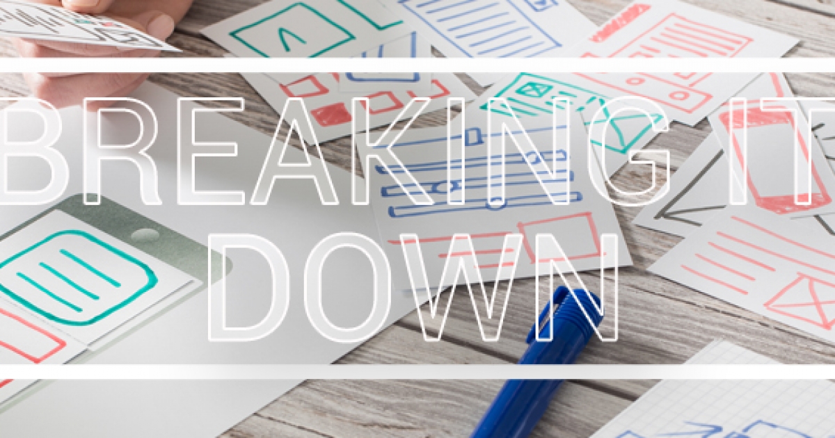
To make the process a little easier, here are the most common design options being used on websites:
Webpage Layout
Responsive & Adaptive website design is a requirement in today’s mobile society. Responsive & Adaptive websites are similar in that they both change appearance based on the browser environment (or screen size) they are being viewed on. You can usually tell the difference between the 2 types when visiting websites. Responsive design is smooth because the layout is fluid. Adaptive design snaps into place because the page is serving something different for every browser, screen or device size.
Responsive Website Design
Responsive website design (RWD) is a website built so that it looks and operates the same when viewed on any browser, screen or device size. Responsive websites respond to the size of the browser or screen at any given point. RWD is (in my opinion) the better strategy for future-proofing your website against possible (even unreleased) devices on the market.
Adaptive Design
Adaptive web design is different from responsive design in that there isn't one layout that always changes. Instead, there are several distinct layouts for multiple browser, screen or device sizes. Adaptive websites adapt to the width of the browser, screen or device size at a specific points. The layout sizes served to the browser, screen or device depends on the browser, screen or device size used. However, it is important to make sure that the website comes off one URL (website address), otherwise you run the risk of being penalized by search engines for duplicate content.
Website Design
Skeuomorphic
Skeuomorphism is making items resemble their real-world counterparts in an online environment. Buttons, icons and pictograms are created to resemble their real life form. However, the perfect balance has to be maintained between aesthetics and speed, because a website that is too slow to load, or fails to adapt to browser, screen or device sizes, is doomed. Skeuomorphism doesn’t take into account digital usability, it refers to the imitation of the way things used to look.
Flat
Flat design is design stripped down to the basics. Flat design means designing without the gradients, shadows & skeuomorphism to achieve what appears to be a ‘flat’ interface. Flat design speeds up load times and looks as good on high or low resolution screens. Facebook, for the most part, is a flat design – though it has slightly shifted to ‘semi-flat’ by bevelling some of it elements. In order to achieve flat design, we must focus on what things do, rather than what they will look like. Flat design has its focus on raw functionality, appearance is secondary. Flat designed websites load faster than websites full of animation and complex graphics.
Material
Material design, is a set of design standards developed by Google, which took the best parts of flat design and then added back subtle touches of dimension. Material design isn’t such a big departure from flat design. Both use the same clean and minimal aesthetics. Material design makes transitions appear more unified with the concept focused on enhancing usability and user interaction. Material design makes it easier for website visitors to understand the cues and directions of the website creating a more intuitive navigation experience across the entire website. Material design brings back some of the techniques that make visuals more engaging, and it continues to evolve with trends and user wants.
Interactions, Animations & Effects
Microinteractions
On nearly every website we visit we encounter microinteractions, but we don’t usually notice. Every time you change a setting, sync data, set alarms, create logins, set status messages, ‘favourite’, ‘like’ or ‘share’ something, you are engaging with a microinteraction.
Parallax Scrolling
Parallax Scrolling is moving different parts of a website page at different speeds. Parallax Scrolling is a great feature for engaging visitors, providing a smooth visual narrative that will keep a user engaged. However, Parallax is mainly a desktop effect at the moment, and is not as mobile-friendly as designers and users would like it to be. Improvements in Ajax and other auto-loading strategies, is improving these issues.
Iconography
With the minimalist nature of ‘flat’ & ‘material’ design, icons need to hold the narrative to keep things interesting. Icon’s need to become more of an artistic element for a website’s expression.
Typography
The way we use fonts has changed with website design. Once upon a time it was frowned upon to use more than a couple of fonts on a site. Now the trends is to blend fonts that work well together in a single page. This not only includes different fonts, but also font sizes. But, fonts must be compatible with the product and be web responsive.
Accent Colors
Contrasting bright colour accents against muted backgrounds and surrounding elements, provide more control over focal elements of the webpage.
Or you can make it easy on yourself! We can consult you on your website requirements, building or outsourcing your web team, or advise on your current website.
See what we have to offer
Web Producer, Creative Director, Content Creator & Distributor at clearFusion Digital, & specializes in helping businesses plan & grow their website.


